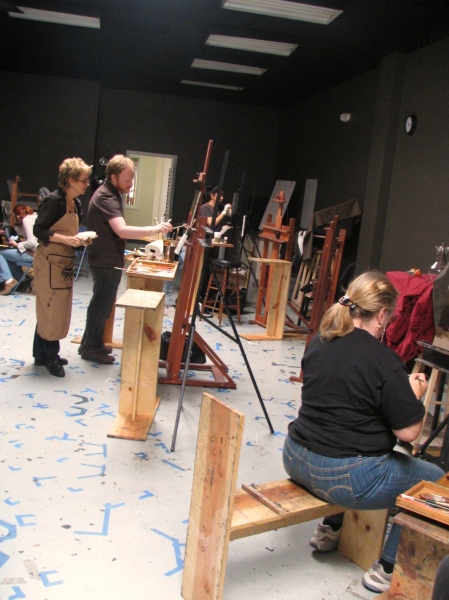
Painting still life in a sky-lit studio
As my spring elective, I am taking Michael Siegel’s Still Life Oil Painting, which is part of the LAAFA Sessions program. The course runs for 10 weeks, and I am planning to blog each session, or at least the highlights of what I learned that day.
The first session was split part into a demonstration/lecture, and part into students starting a still life of their own. I took furious notes, and in the interest of fairness would like to make three disclaimers:
1. This entry is really long. Just don’t say I didn’t warn you.
2. Everything I am posting is what I learned and retained, subjectively and individually, and may not reflect the views of the management correspond 100% to what Michael actually intended to convey in class.
3. During the first session, my camera was broken and I am stuck trying to communicate ideas without photos which would have been really helpful. Insert sadface.
Let me start by stating that I can’t say enough good things about Michael as an instructor. Being highly proficient in a medium is not the same as being able to teach your skills to someone else. Good teachers are just as hard to find as good artists. Michael has incredible skill as an oil painter, and I am delighted to find out that he is a fantastic teacher. He has a clear grasp of the ideas behind the school of painting in which he works, and can convey those ideas in a very lucid way to the students, both through demonstration and just by talking you through them.
Before I delve into session notes, I want to talk about the school of painting Michael Siegel teaches. It is rooted in realism – in portraying a physically observed reality, with fidelity to the way it appears to the eye. This school is based on Flemish-as-evolved-into-contemporary painting, with techniques originating in Holland in the 1700s, and developed further by David Leffel in our own time.
The central idea of this particular school is that the painting is a story, and the main storytelling tool for the artist is light. Like the dramatic structure of a play, the light travels through a painting in a path that has a beginning, a middle and an end. As it moves across the picture, the light starts slowly and at a low pitch, then builds up until it reaches a climax of intensity in the focal point, and then flows out.
The artist leads the viewer through the piece, using rhythm, contrast, greater or lesser amount of visual information. Light is the vehicle through which all these qualities play out their parts in the visual drama that is a work of visual art.
And now to the session notes! Michael took us through setting up your equipment and to the first two stages of building up a painting.
SETTING UP EQUIPMENT:
Paints
Michael uses a particular staple palette of colours, to which he adds a specific pigment or two depending on the demands of a particular piece:
• Naples yellow (warm)
• Yellow ochre (warm)
• Red ochre (warm; also known as terra rosa or venetian red)
• Cadmium yellow deep (warm)
• Cadmium yellow light (cool)
• Cadmium red light (warm)
• Pthalo blue (cool)
• Ultramarine blue (cool)
• Burnt umber (warm)
• Raw umber (cool)
• Ivory black (cool; has a degree of transparency and a richness about it)
• Alizarin crimson (cool)
• Lead white (cool; also known as Cremnitz white; has more body and opacity than other whites, lasts longest)
When discussing palettes, most instructors advise that a palette should have cool and warm versions of yellows, reds and blues. I asked Michael why he chose these particular warm and cool pigments over others, and he said he didn’t have much of an esoteric explanation beyond that they have stood the test of time in terms of being useful to realist artists.
He did say that he likes ivory black because it is a rich black with the right degree of transparency about it, somewhere between totally transparent and totally opaque extremes. He also likes lead white because it has more body and opacity than other whites, and a greater longevity.
Medium
We are using Maroger Medium, because it makes paint more flowy and easier to move around, and also because at the same time, the paint will hold the stroke and not settle any further when you lift your brush. Maroger is also transparent and non-yellowing.
The other medium I am going to try out is Italian wax, also known as cold wax. It’s opaque and is used for impasto.
Brushes
What surprised me was that Michael was getting perfectly nice colour on the canvas by using one or two brushes, simply wiping off old paint with a paper towel. I think the lack of colour contamination has to do with the brush stroke techniques Michael is also teaching us, which I will talk about later.
I am working on an 18” x 20” canvas, and using natural bristle filberts #2, 4, 6 and 8. In the first session, I found myself wishing for a bigger brush – a 10 or a 12, at least for the background.
The setup
Before work starts, you prepare the palette and the paints, just for the sake of greater efficiency later on. It’s a good idea to get the paints to have the same approximate consistency by mixing them with the medium, because paints have different degree of stiffness if you use them straight out of the tube. At the start of the painting, you also want them more runny than later on, but the general idea is to get them to a kind of mayonnaise state.
The paints are usually squeezed out along the edge of the palette, going from earth pigments (naples yellow, yellow ochre, red ochre) to cadmiums (cad yellow deep, cad yellow light, cad red light) to dark colours (phtalo blue, burnt and raw umber, ivory black, alizarin crimson). The white is handy to have in its own corner, and the medium should get its own corner too, to avoid mixing those two with other paints by accident.
These things are optional, of course, but I personally find that having the same tool in the same place each time is helpful, so you don’t have to search for it, so I am on board with laying paint out on the palette in a specific way. Also, that way you get the same colour on the same spot, so it stays cleaner.
Beginning a painting: stage 1
Until now, I have always done a meticulous drawing of the objects first, and transferred it to the canvas before painting. Here, we start with paint immediately, on a canvas toned to a mid-tone with a neutral pigment (in my case, burnt umber).
At the start, it helps to use a lot of medium because the canvas is so dry. It’s also important not to start inching closer and closer to the canvas until your nose is boring holes into the paint – something I tend to do. A good32 remedy is to put the palette between you and the canvas. I tried it and it worked wonders, for looking from enough of a distance to see the painting as a whole.
The first order of business is not the intricacies of contour or any sort of detail – we just massed in the large forms, almost feeling them with the brush rather than drawing them.
Michael suggested that we try to “find the weight of the objects and feel the hump of something being there”, block in the heaviness more than any other quality. I really liked the idea because it has a sculptural element to it, and because it makes sense somehow – to touch the objects into the canvas rather than draw them on the canvas.
Another direct quote I love is “What you feel is what you will be able to communicate. The viewer will feel what you feel about the objects as you paint them”. Of course in my case that means what the viewer will feel is aggravation and confusion, but I really like the idea – that you try to feel your way into the painting. I was expecting a realist painting class to be cerebral and steeped in theory. This very intuitive approach is a surprising pleasure and something that definitely feels true. Painting is a form of sculpting, of forming the content as if it really is solid reality.
So, you move around the canvas, feeling your way around the masses, and trying to look at groups of objects as single masses of light and dark rather than mentally dividing them into specific bits of fruit, dish, or whatever. The idea is to look at things as chunks or blocks rather than recognizable objects at this particular stage.
Brush strokes
I’m using the brush in a way I never have before, and I’d be lying if I said it wasn’t painful. In fact, I issued the following plea for help sometime mid-class: “My brushwork is ugly and I want to die!”
The plea was because I am used to handling paint in exactly the way this school cautions not to do: by drilling it into the canvas with lots of fuzzy, overlapping strokes, kind of like a dog digging a hole, and by applying a degree of pressure that is also comparable to a drill. Here is a better way:
– Make definite brushstrokes that are a statement with a beginning and an end.
– Apply a brush stroke once, then lift your brush off the canvas, look and think.
– Paint slowly and deliberately.
– Hold the brush parallel to the canvas, not at a right angle to it.
– Have your fingers near the end of the brush, instead of holding it right by the ferrule.
– Build the painting as a series of definite strokes next to each other. This is not to say that you can’t apply paint over existing paint – but in strokes that are separate gestures, with the brush coming on and off the canvas with a specific intent in the painter’s mind.
– Have paint only on the end of the hairs, rather than loaded up to the ferrule. That’s what makes the brush easy to clean while painting, and keeps the colours from mixing into each other.
– Load the brush enough that there is a good layer of paint between it and the canvas.
– Apply little pressure. If you put too much pressure, you run out of paint quickly. There is also a saying, “you shouldn’t hear your brushstrokes, only see them.” If the brush is making abrasion sounds, it’s too dry and you are probably having to grind the paint into the canvas in order to make a mark. It probably also means that your paint is getting squeezed up the brush and into the ferrule where it will A) be impossible to clean and B) will eventually eff up the brush. And you are also effing up the brush simply by being so rough on it. (By all means do so if your aesthetic dictates, but in this particular school of painting, it doesn’t.)
Another interesting thing about brush strokes is that you only have two types, really:
1. Strokes that go with the form: these speed up the energy of the painting, and give direction in which it flows.
2. Strokes that go against the form: these slow down the energy of the painting, and give a sense of weight.
Coming back to the painting, we now have overall shapes massed in with a fairly dark paint, preferably of neutral colour. At this point, everything is very loose, open to refinement, and there are no details or much in the way of oblique angles. It’s all about placing the objects and thinking about filled space vs. empty spaces, and putting down very simple, general information.
Now that there are some masses on the canvas, it’s time to give them some dimension by blocking in the shadows, both on the objects and the shadows the objects cast.
The Flemish/Leffel school has a very interesting way of thinking both light and shadow – they are a sort of yin/yang pair of world-shaping forces on the canvas. Light is fluid and ethereal, it wants to flow and spill over everything, it is about air and movement, it gives direction and it knows no boundaries. Shadow is firm, it’s about weight and containment, it wants to block off, cup off and come to a rest; shadow gives stability and gravity. Shadow is the base of things and the ground the painting is built on. Shadow is boundary.
The last shadow in the sequence of the painting, (i.e. the story the light is telling, the sequence in which it flows and the order in which we want the viewer’s eyes to go), has to be strong enough to hold the light of the whole painting. It’s like the last chords of a symphony, ending the narrative with a final statement and creating something that is complete.
To use a concrete example, let’s say there are some grapes, then an interesting bottle, then some tangerines and some more grapes. The light is coming from the right. It starts off not being too strong, and not illuminating anything too bright (right edge background). Then it comes to the grapes and the intensity of the painting starts picking up, but it’s still low. Then the light hits the bottle and the very bright tangerines, and explodes into a great big party! – oh, but being light and wanting to move, it flows past the focal point, onto the grapes, and then it wants to move on and right out of the painting. To contain it, to give a sense of closure and weight to the piece, and to direct the viewer’s eye back into it from the left edge, we want to emphasize the shadow on the block formed by the tangerines. It will cup the light and turn it back in, like a little metaphysical traffic controller.
Dealing with transparent objects
Transparent objects are a type of contrarian. Everything that light does on a transparent object is the opposite of what normally happens. If you have an apple, light hits it on the area closest to it, and then goes on past it as the apple’s form turns away. The apple is lightest on the side closest to the light source, and darkest on the side furthest away from it. Makes full and excellent logical sense.
On a bottle, on the other hand, it’s all through-the-looking-glass. The light doesn’t hit the form and bounce back/flow past. Instead, it passes through. So what we have is a thing that is darkest on the side closest to the light source, and lightest on the side furthest away from it, with a very bright highlight on the dark, closest-to-the-light side, just to keep things interesting.
The more transparent the object, the more of this behaviour you will see from it.
Here is probably the most important thing I learned that day: in general, in order to communicate something about the nature of an object, you communicate how light interacts with it. If you suggest the behaviour of the light in a believable way, the object will be recognizable and believable even if you don’t render it in photographic, excruciating detail.
Back to the painting. After the shadows are blocked in, there is no reason why you can’t add lights and even highlights. There is no rule that says you have to, either. The idea is to start establishing the value relationships within the painting, which is going to entail dealing with extremes of light as well as with the midrange, so at any point past this stage it’s ok to start putting in that kind of information as needed.
Next stage: relating the objects to the background
Now we are starting to introduce background colour, but doing it for the purposes of setting up relationships rather than for any sort of finish. Painting entails a series of decisions about value and color relationships, and you need all the basic information to be in at the beginning.
At this stage, it’s not necessary to paint the background straight to the edge, and it’s important to keep possibilities open, so the best things is to go around the objects, but not going right up to the edge, creating a sort of halo instead.
In terms of colour, generally we want the background to recede into the distance, and also to stay self-effacing in terms of visual importance, so it’s a good idea to have the background be neutral. Neutral in this context means “neutral in relation to the objects,” rather than “make it beige”, though. If the background is bright, but not as bright as the objects, the principle still holds and the background still recedes.
Now that the background is in, you can gauge how the massed-in forms are relating to it, which will inform the direction you need to take next.
Suggesting round form
At this stage, we are also looking at light areas on the form, and laying those in. A major key to suggesting dimensionality is in dealing with edges. There are generally 3 types of edges on a given object:
1. Leading edge – the first edge where the light hits, and where the background meets the object.
2. Transitional edge – this is the edge of light and shadow on the object itself.
3. Last edge – where the shadow side of the object meets the background.
If all the edges are hard, and if the only information we give the viewer is background, lit part, dark part, background, the object will look fairly flat. On the other hand, if we fuzz up all the edges, every object will look like something made out of cotton, or a tennis ball the dog’s been at for years.
The solution is in where to direct attention. The Flemish/Leffel school has a wonderful term, focus. The more focus you give something, the more that something will mean and the stronger it will “sound”. Focus has to do will contrast, with definition, with visual interest, with the greatest amount of light, and also with the amount of detail in the information we give about what the light is doing. It’s to do with giving the eye things to focus on.
In the case of our object, let’s say again that it’s an apple. We want a strong, defined leading edge that tells us a smooth surface is involved. And we also want a strong shadow-side edge, where the form ends, because a visual sequence is over, and in order for something new to start, something has to end and have some closure.
In order for the form not to read as flat, however, we shift focus away from the edges and onto something else: a highlight. First, it’s additional information about the light, so the eye is going to be chewing on that and processing the fact that highlights happen on something convex. Second, it’s something else to occupy it so it’s not fixating on the hardness of the edges.
Another measure to suggest volume is to soften the transitional edge. Of all the edges, this one can be legitimately fuzzy without making the object itself look fuzzy when it isn’t. In fact, if the light doesn’t happen to fall off a hard shift in planes, the transitional edge has to be soft, otherwise we end up with a square apple.
And finally, we can also reduce the focus on the shadow-side edge by reducing the contrast between it and the background. We can do it by bringing the value of the background closer to the value of the object, by making it lighter or darker. We can also do it by giving the shadow some reflected light, if the background is lighter than the object.
The nature of natural light
Realistic still life is something that natural, diffuse light probably serves best. This light has particular ways about it: it is cool and it makes the shadows warm. The darker the light, i.e. the less there is of it in a specific part of the painting, the warmer and richer everything is.
Shadows on various objects in a particular setting have the most similarity in terms of colour, and the least amount of local colour information. So rather than painting purple shadows on grapes, brown shadows on tangerines, etc., it’s better to decide on the particular gist of shadow information, to place it in, for instance, a brownish-greenish neighbourhood. This brownish- greenish shadow cast will lean a little more towards purple on the grapes and a little more towards reddish brown on tangerines, but those shadows will be cousins as opposed to absolute strangers.
This approach keeps a painting cohesive, and gives a sense that all the objects in it live in the same universe.
Where the most local colour happens is where the most light happens. Light is what illuminates colour, and if most of our light is on the focal point, then the brightest colours and the most colour information will be there as well, which is handy for creating areas of intense focus vs. areas that are quieter.
In general, what I have learned so far really helps me move in the direction that I am pursuing in painting – working an image in terms of the kind of “silent sound” that powerful paintings generate. It’s almost as if paintings are like music, with parts that are calmer and simpler vs. parts that are pregnant with tension and meaning, that hum and reverberate with this silent sound.
I have struggled to create this kind of orchestration in my still lifes, and this method is meshing with what I have been looking for so perfectly, it’s as if I have been wandering in the desert dying of hunger and thirst, and now I am being ushered into a gigantic feast and fanned by handsome servants.


