Studio Mysteries

May 27, 2009

Give Me Studio Time Or I May Have To Cut A Bitch

Filed under: Being a Professional Artist — Anya Galkina - Studio Mysteries @ 1:15 am

The deeply mistaken assumption that civilians often make about artists is that it is a chosen lifestyle. This deeply mistaken assumption is deeply mistaken.

I have never been able to go for long without shutting my door on the world, and being… away for a while. If I don’t get to sit and work on a drawing or a painting, I get itchy, cranky and resentful. In some respects, being a full-time art student is really spoiling me, because now I get cranky and resentful a lot faster.

A long weekend just ended, and I have spent most of it working on a web design project. Four days without any art time is BOTHERING ME.

Is there anyone nearby that I can safely stab?

May 26, 2009

“Go Ahead. Make My Day.”

Filed under: Art School Moments — Anya Galkina - Studio Mysteries @ 4:12 am

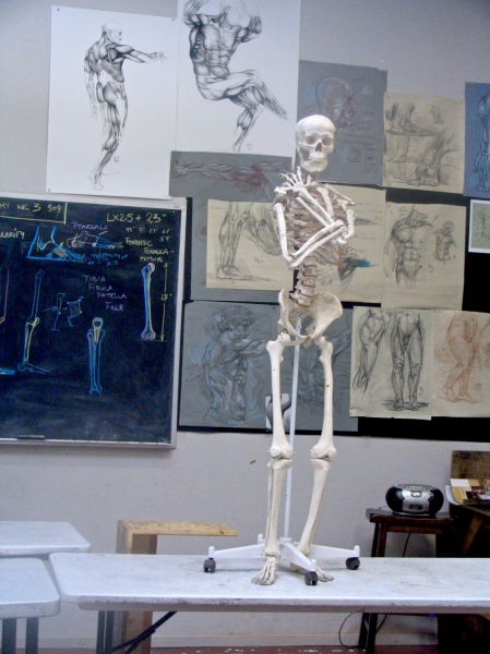
2009_schoolphotos_classroom_skelly

You may think you know something about life, but Oscar the classroom skeleton is not particularly impressed.
 

May 24, 2009

Norbert Grew Some

Filed under: 3D Anatomy Course, Anatomy, Ecorche, Rey Bustos — Anya Galkina - Studio Mysteries @ 5:32 pm

The 3D Anatomy/Ecorche course with Rey Bustos is more than half-way through, and we are finishing up the skeleton. Rey spends a lot more time on the bones than on the muscles. It makes sense because if you get the skeleton right, getting stuff to drape over it correctly is a breeze. But if the underlying structure is wrong, then the muscles hang off it wrongly too.

This course has been one of the most challenging classes I have ever taken, because it’s two steep learning curves for the price of one (unless you are a sculptor who is used to small-scale work). I have sweated many, many hours not only wrapping my head around complex anatomical information, but on top of that, trying to create a 3D version of my class notes in a material I have never worked with before.

I’d be lying if I said this project wasn’t overwhelming and frustrating at times – many times – but as I persisted and kept sweating through it, it has gotten easier and more rewarding. The human skeleton looks more and more beautiful to me. It is also becoming known, charted, even well-loved territory, whereas before, it was an alien and incomprehensible terrain.

As we go through the course, I realize how much we are just scratching the surface of what there is to know. I read somewhere that in gaining any new skill, you go through four stages:
1. Unconscious ignorance – when you don’t know just how much you don’t know.
2. Conscious ignorance – when you are crushed by the realization of how much you don’t know.
3. Conscious knowledge – when you begin to acquire mastery over the subject, and are tickled pink about it.
4. Unconscious (internalized) knowledge – when your knowledge informs what you do without you having to stop and think about it.

On a clear day, I can see Stage 3 from where I am. Far away, though.

Ecorche Norbert Is Getting Bigger and Stronger.

Ecorche Norbert Is Getting Bigger and Stronger.

May 22, 2009

Permission to Be Boring

Filed under: Painting — Anya Galkina - Studio Mysteries @ 4:02 am

One way to tell whether an absolute beginner designed a flyer is if it uses half a dozen fonts or more. The first thing graphic design students learn is to impose limits: on typeface choices, palettes, italics and bolding. It makes sense: if everything is bold, nothing stands out. It’s kind of like trying to hear a lecture on a crowded school bus where everyone is talking.

The same thing holds true for drawing and painting. The trick is not in articulation and detail, it is in making things shut up and sit back – so that other things can have the microphone. What makes a painting is not placing the perfect highlight, it’s orchestrating the rest of the painting so that the perfect highlight is a solo that can be heard above the other instruments.

A painting is not a democracy. Something has to be more important than something else, and the less important bits cannot be held back enough – most people put in infinitely more information than necessary, much more “too much” than “not enough”.

This, however, is wonderful news! Instead of rendering everything with the meticulousness and intensity of an out-of-control android, we can be vague! And plain! And smudgy!

Not explaining everything runs counter to our impulses, because, as Michael Siegel points out, we artists are forced to look at everything within the scene we are painting, whereas most people in their right minds would only look at the interesting parts and then go have a sandwich. And if we look at something intently, we want to draw it or paint it. But in fact, NOT drawing it is much easier.

“So what information should we paint, and what information should we leave out,” you might be asking. Good question! One that cannot be answered definitively and permanently! It all depends on what’s important in a particular picture, which is something that only you, the Benevolent Dictator of Every Inch of Your Canvas, can possibly decide! But: generally speaking, we can’t perceive things that are lit and things that are in shadow simultaneously. We are either focused on one or the other, unless we are experimenting with illegal substances, which would be illegal and morally wrong as well.

Common sense dictates that the bits of a painting that are really important should be lit, because if they are in shadow, you can’t see them very well. So the answer, insofar as one is possible, is to vague it up in the shadows and to reserve the detailed, articulated solos for the light.

Shadows: it’s where being lazy is the Right Thing. Don’t you love shadows just a little more now?

May 12, 2009

Head Drawing: Sang Bang’s 5-Step Recipe

Filed under: Drawing, Portraiture, Sang Bang — Anya Galkina - Studio Mysteries @ 9:10 pm

Sang Bang is a Los Angeles figurative artist. He also teaches, in so many places that LAAFA, the Art Center and OTIS are by no means an exhaustive list. Sang has a blog at paulaesthete.blogspot.com, and he taught us two awesome Head Drawing classes last month.

Sang’s approach is what I think of as recipe-based. To make a nose, Sang says, do this. And to make an eye, do this. And if you do, you get a nose or an eye, and it’s not very hard at all! I love his practicality. It’s all very well to shroud art in kung-fu-like mystery, and demand that your students suffer (SUFFER!), but as Sang showed us, it is not 100% necessary.

So, the head. This class, I got the most likeness I ever got out of a model, and I didn’t even have to rearrange her lovely face:
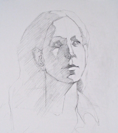
CLASS_2009_headDrawing_sangBang_final

The recipe runs thus:

Step 1: Positioning the Major Intersections.

CLASS_2009_headDrawing_sangBang_state1

Start by marking down the center axis of the face, paying attention to the tilt.

Mark down the top of the head, and the bottom plane of the jaw. This doesn’t mean the point where light breaks on the chin, but rather the point where people get a second chin when they get a second chin.

Find the imaginary line running through the tear ducts. Books usually claim that it’s exactly half-way down the head, but it’s not. Books lie because they enjoy seeing you sweat.

Mark down the base of the nose, and the center line of the mouth (where the upper lip meets the lower lip).

Note the distances marked by the red arrows. Getting them right will go a long way towards a good likeness.
 

Step 2: Let There Be A Nose.

CLASS_2009_headDrawing_sangBang_state2

Set up a nose by finding the angle it comes down at, and by creating a trapeze-shape for the base plane. Note how much of the base you can see from your position.

Things to get right include the relative proportions of the top and the base, and how wide the nose is in both those parts.
 

Step 3: Sockets!

CLASS_2009_headDrawing_sangBang_state3

OK, this part can be tricky because sockets were designed to accommodate the eyeballs, and also to generate maximum confusion.

Try to locate the bridge of the nose first. There will usually be some helpful shadows where the plane changes from forehead bones to the nasal bone.

From there, find the top edges of the sockets. Check how high they are in relation to the nose bridge – this distance varies a lot from person to person.

Don’t be misled by the eyebrows. Sometimes they sit on the edge of the socket and sometimes they wander all over the place. Draw the socket first – you can plant the brows on it later.

Between the top edge of the socket, and the line of the tear ducts, you can start triangulating where the actual tear ducts are on that line. Check their relationship to the vertical lines of the nose and the widest point of the nose. If you draw an imaginary vertical line from the widest point of the nose, where do the ducts fall, to the right or to the left of it? How far?

OK, now you have the distance between the eyes. You can use it to measure the size of the eyes, and then mark down the outer edge of each eye. The socket forms an angle around there, which you can take back up to the upper edge of the socket. Hooray! Sockets! And a rough position for the eyes!

There is lots to finesse from there, once you get the position of the top and bottom of the eye. To get those, the tear duct line makes a good reference point. How far above and below it does the eye end?
 

Step 4: A Mouth Would Be Nice.

CLASS_2009_headDrawing_sangBang_state4

The mouth is easy. After the hellishness of the eye sockets, the mouth is a breeze.

The proportions to mind are the width of the center line, and the thickness of the top and bottom lips. To position the corners of the mouth, drop an imaginary vertical line from the tear ducts and from the outsides of the eyes.
 

Step 5: Triangulating The Ears.
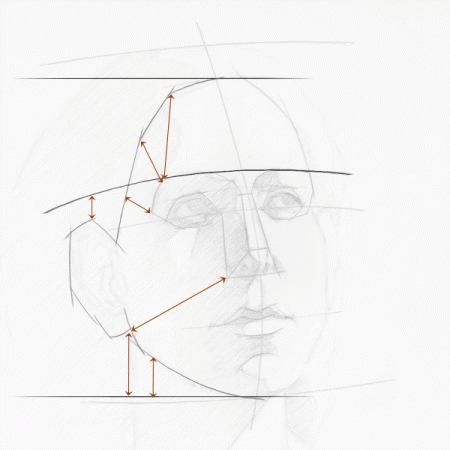
CLASS_2009_headDrawing_sangBang_state5

Oh boy. It’s not as difficult as mapping the sockets, but strangely enough, more eyeballing is involved.

Start with imaginary horizontal lines through the top of the hairline and the bottom of the chin. Map the hairline and the jaw angles, using the horizontal lines as a reference. See all the red arrows? The billion red arrows? Those are all visual comparisons and triangulation references. The jaw and the hairline have several highly visible changes of plane, and at those key points, you can look at the angles they are at, in relation to other key points.

This stage involves shuffling things around until they look right. I’m usually tempted to stab myself at this point, but not as much as during the Socket Stage.

OK. The angles are in place, and Martha Stewart, Queen of Precision, is no longer choking with laughter. Now we find the top and bottom of the ear. See the imaginary line running over the top of the eye sockets? That’s a good reference for the top of the ear.  The bottom of the ear is at an angle to the nostril and it’s somewhere higher or lower in relation to the corner of the mouth.

Phew. That’s the ear. Making it ear-like is not too hard if you track the major changes in contour direction with straight lines, rather than try to match the curve with, for lack of a better word, curves.

From there it’s all coasting downhill with fun hair shapes. And then? Shadow shapes, laying in major values, doing some praying mantis kicks edge management, ooh, halftones and well, that’s a whole ‘nother post. Or seventeen. Which will be coming at some point!

Many thanks for Lisa Marie for her total mastery of stillness, and to Sang Bang for an informative and helpful class.,
May 4, 2009

Rey Bustos’ Propeller Pelvis

Filed under: Anatomy, Rey Bustos — Anya Galkina - Studio Mysteries @ 6:08 pm

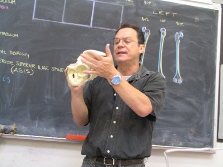
Did you know that the pelvis has a propeller structure? Bet you didn’t know that. Propeller structure, in engineering terms, means a plank that has been twisted, so that one part of it is at an angle to the other.

The bones of the pelvis are twisted just like that! The upper pelvic bones (the ilium), are at an angle to the lower pelvic bones (the pubis). Check it out:

2009_anatomy_pelvisdirection3

See the direction in which Rey’s fingers are pointing? That is the angle of the ilium planes.

2009_anatomy_pelvisdirection1

Now see the picture below – the pubic plane is a totally different direction:

2009_anatomy_pelvisdirection2

See? It’s a propeller plank!

This is why anatomy is impossible to learn purely from books. You need a teacher with a passion for the subject and a good sense of humour.

P.S. That is a very understanding pelvis, especially considering it used to belong to a dude. As Leonard Cohen says, we are so lightly here.

May 3, 2009

A Word On The Maroger Medium

Filed under: Painting — Anya Galkina - Studio Mysteries @ 2:28 am

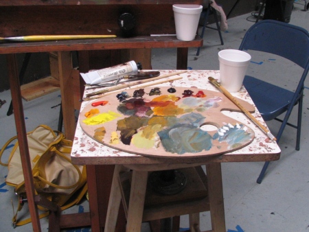
And that word is “awesome”. Maroger is a substance stolen from the gods along with fire, chocolate and indoor plumbing. It’s like silk, if silk were made of lead, resin and petroleum byproducts. Seriously, Maroger gives paint the most luxurious feeling I have ever experienced, and oil paint is pretty damn luxurious to begin with.

Maroger does two things that shouldn’t happen at the same time, but they do:

1. It makes paint run and spread much easier. It flows and obeys.

2. It makes paint hold the gesture of the brush and retain texture extremely well.

I don’t know how it happens. Must be one of those “caramel inside a chocolate bar” type of mysteries.

I also have to point out that Maroger is hellishly toxic, and that you should use it in a well-ventilated room or paint with a mask using filters designed for volatile organic compounds, unless your sensibility tends heavily towards the psychedelic. In which case, Maroger fumes will get you there in half the time for half the price!

Bliss Station

Bliss Station

Still Life Painting with Michael Siegel: Session 2

Filed under: Michael Siegel, Painting, Still Life — Anya Galkina - Studio Mysteries @ 2:10 am

Please note that this will be a normal-length post 🙂

I’m realizing that the lecture we had during Session 1 was a huge info-dump. It was kind of a distillation of a long study of painting, thrown at us like some sort of magical monsoon. Now, as we work on our own paintings, Michael revisits the ideas from the lecture over and over, so as I post along, I’ll revisit the ideas from the first post on this subject too.

The idea I thought about the most in this session is suggesting an object by suggesting how light behaves on it. Even if the suggestion is rough and not very detailed, if you give the right information about light, the viewer will respond by seeing the object and not just a bunch of blobs.

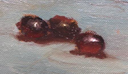
You know what’s a good way to test this? Grapes!

2009_painting_siegel_session2_03

Grapes are simple: they are transluscent as a whole, but the lit plane also has some dusty and hence opaque stuff sitting on the surface. So, to suggest a grape, you suggest a transparent object, which means that it’s dark overall, it has a sharp highlight on the side closest to the light, and it is lightest on the shadow side, where light is passing through and out of the object.

So, dark blotch + light spot on opaque lit plane + highlight + internal, passing light on the shadow side (where normally opaque objects are darkest, but transparent ones are lightest) = grape. If you want to make the grape really, really transluscent, make the internal light brighter and more colorful, and the highlight sharper. If you take those things to extreme, you’ll have a grape made of glass!

Another good illustration of the light behaviour principle is this cup:

2009_painting_siegel_session2_02

Right now it’s a pretty fuzzy-looking cup, for being made of porcelain, but bear with me, Cosmos. Cups aren’t built in a day. The main thing here is that the cup is looking A) three-dimensional, and B) heavy and planted on the table surface, and all that is because the light information is there, both in where it hits the form, and where it slides past it.

The more I learn about painting, the more I realize that it’s a study of visual cognition, of how we perceive and process information about our environment, how we are always reading what’s lit, what’s in shadow, and whether it might be a hungry leopard or an edible plant – how we relate to the world first and foremost through our eyes. More than anything else, painting is a magician’s act, a way to trick the eye into seeing what the artist wants it to see instead of pigment spread across a flat surface. It is a noble trickery, and I intend to use my powers for good when I develop them fully. Scout’s honour.

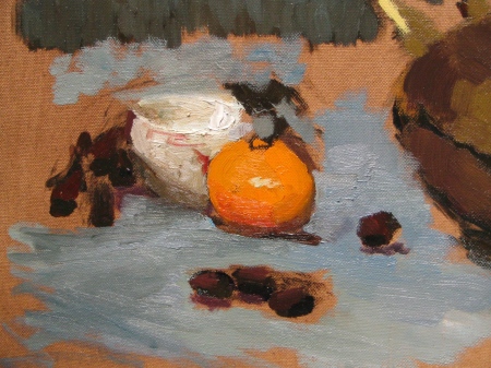
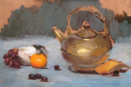
2009_painting_siegel_session2_01

This is where my still life is at as a whole. One of the things I am struggling with is how to maintain accuracy in the structure of the objects, especially the teapot, as I wing it with the paint. I think that in the future, once I get the painting to this stage or even a little earlier, I will take a sheet of paper and do a very structural drawing of the still life, and then make corrections in the paint, as necessary. But it feels right not to do it at the very start of the project – I LOVED being able to feel my way into the canvas, to touch and sculpt the objects with paint. I think doing that first is more important than getting worried about finessing ellipses and so on.

Which is another argument for keeping things fairly open and undefined until you are a fair way into establishing the value relationships. Mmm… fuzzy teapots…

Blog at WordPress.com.